Having successfully directed and managed the Dulux South Africa social media channels for a year, FleishmanHillard (FH) was tasked with supporting the launch of the new Dulux Visualizer app in South Africa on social media. This smartphone app allows users to picture what a room would look like painted in any colour, before physically painting it. The app technology used is a great achievement as no app has been able to understand its environment and identify borders (in this case, walls) until the Visualizer.
WHAT WE DID:
A common frustration with professional decorators as well as DIY home owners is choosing a wall colour from a simple swatch. Although accurate, it is often difficult to imagine the colour across a large area. This presented FleishmanHillard with the opportunity to educate South Africans on the benefits of a real-time visualization of their personalised spaces.
We needed to do some research to determine how we were going to launch the app. We discovered the main interest points in line with DIY and décor audiences in South Africa focused on simple inspiration items or places. Our data revealed that scenic images of nature and flora far outweighed other content.
We developed a strategy to share tips and practical examples of how the app can benefit people wanting to decorate or refresh their spaces. All messaging emphasised that the app had to be downloaded to be tested. Our team also used the insights around images of nature and the outdoors to develop the online content and showcase elements of inspiration. As the app evolved and updated versions were released, we prepared content to announce the new features. These moments were also used to leverage new interest and promote a second revival during phase two of the campaign.
With the understanding that consumers appreciate collaboration and being included in the conversation, we proposed a competition that allowed users to generate their own content for the Dulux brand. This directed fans to the app download and asked them to share their inspiration from nature along with an image of their transformed room – done using the Visualizer app. We also spent time identifying and compiling sub-audience lists outside of the core target market that would be interested in the app, such as new home owners, and new/expecting parents.
A month into our three month campaign, we analysed the feedback provided on the app store ratings to further fuel our content strategy moving forward. Instead of addressing these in a negative light, we used it as an opportunity to spin the issues into educational and instructional content.
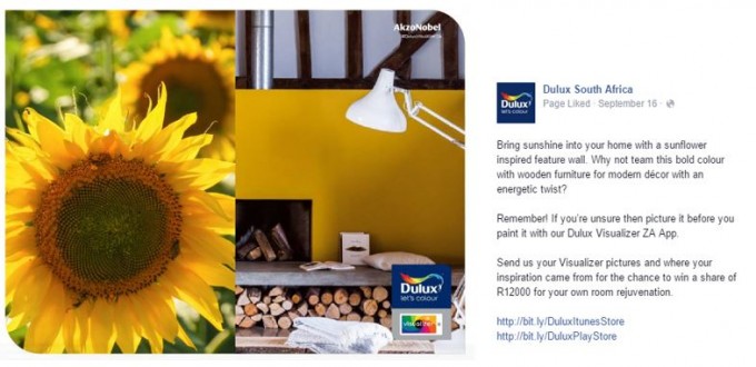
Daily content was shared on our social pages conveying images of inspiration from nature, such as oceans, shells, and flowers. These were accompanied by interior spaces with the inspired colour choices. This effectively explained the purpose of the app, as well as offered a simple and easy way to download the app immediately, encouraging people to test it for themselves. Our efforts were aligned with a TVC that went live during the same week, and an influencer campaign (not fulfilled by FleishmanHillard) that we supported through the Dulux channels to encourage consumer trialling.

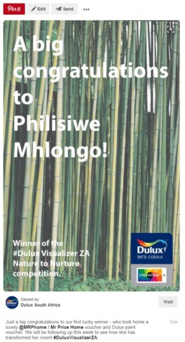
Tapping into consumer content insights, we also ran a simple competition calling for entrants that showed both their source of colour inspiration, and their transformed room. This helped to drive downloads, encouraged content sharing and community collaboration, as well as showcase all the features of the app that include real-time visualisations, a masking tape tool, and a photo-saving gallery. These entries were also shared on a Pinterest Visualizer Fan Board that allowed others to re-pin their favourite submissions. To meet consumer preferences about involvement and acknowledgement, we also created personalised rich media posts to congratulate winners of the weekly competitions.

Our paid media support allowed us to target new audience groups over and above he Dulux community to ensure we were seen by DIY and décor sub-groups, new home owners, and new parents. Through hyper-targeting and daily optimisation, we were able to adopt a flexible approach to the Visualizer launch by monitoring behavioural trends to create upcoming content.
To combat app issues voiced by our fans, we used this as an opportunity to help solve negative experiences through positive messaging. Through suggested ‘success tips’ to get the best results, and sharing ‘how to’ tutorial videos, we decreased the negative feedback on the app stores. For the launch of version two of the app, we prepped educational content highlighting new features and bug fixes that caused initial frustration, to encourage more downloads and pique the interest of a wider group of potential fans.
WHAT WE ACHIEVED:
- We exceeded 50,000 clicks from social (surpassing our goal of by 525%), and contributed to over 200,000 downloads within the first three months.
- We also garnered 20 pieces of consumer generated content.
- Our goal of a 50% increase on Facebook interactions was surpassed by 138% in the first month.